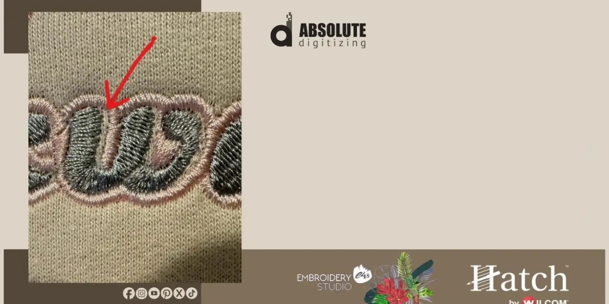

Few things are more frustrating than seeing a beautifully stitched design ruined by tiny gaps between letters. The text may look perfect on your screen, but once it is stitched, spaces can appear between strokes, edges can separate, and small letters may lose their shape.
If you want to fix embroidery lettering gaps, the key is to understand why they happen in the first place. Problems with stitch density, pull compensation, spacing, fabric movement, and poor digitizing can all affect how lettering looks on the finished garment.
The good news is that most lettering gaps can be corrected with the right adjustments and a careful test stitch.
What Causes Gaps in Embroidery Lettering?
Embroidery lettering is more sensitive than large shapes. Small letters have limited space for stitches, so even a small change can make a noticeable difference.
Common causes include:
- Low stitch density
- Insufficient pull compensation
- Excessive letter spacing
- Poor underlay
- Fabric shifting during stitching
- Incorrect stitch direction
- Lettering that is too small
- Weak digitizing
- Incorrect stabilizer selection
- Thread tension problems
Before making changes, identify whether the problem comes from the embroidery file, the fabric, or the machine setup.
How to Fix Embroidery Lettering Gaps
There is no single setting that fixes every lettering problem. The best solution depends on where and why the gap appears.
1. Adjust Stitch Density
If the stitches are too far apart, fabric can become visible between parts of the letters.
Increasing density slightly may improve coverage, but avoid adding too many stitches. Excessive density can make lettering stiff, bulky, or difficult for the needle to sew cleanly.
The goal is balanced coverage rather than maximum stitch count.
2. Increase Pull Compensation
Fabric can move or pull inward as stitches are formed. This can cause letter edges to separate from where they were originally placed in the design.
Pull compensation slightly extends certain parts of the design to account for this movement.
It can be especially helpful when:
- Letter edges appear narrow
- Satin columns become thinner
- Vertical strokes separate
- Rounded letters lose their shape
Use small adjustments and test them instead of making a large change all at once.
3. Check Letter Spacing
Sometimes what looks like a stitching problem is actually a spacing problem.
If letters are placed too far apart in the embroidery file, the finished text can appear disconnected.
Review the spacing between individual characters and consider tightening it slightly where appropriate.
However, do not make letters so close that they overlap or become difficult to read.
4. Improve the Underlay
Underlay provides a foundation for the visible stitches.
A suitable underlay can help stabilize fabric and give top stitches a better surface to sit on.
If lettering looks unstable or its edges move during stitching, review the underlay settings.
Different fabrics may require different underlay approaches, so avoid using one setting for every project.
5. Review Stitch Direction
Stitch direction affects how embroidery behaves.
If neighboring parts of a letter are stitched in unsuitable directions, they may pull differently. This can create uneven edges or visible spaces.
Good digitizing considers stitch direction, fabric movement, and how different letter sections interact.
Small Lettering Needs Extra Care
Small text is one of the most common areas where embroidery gaps appear.
When a letter is only a few millimeters tall, there is very little room for detail. Trying to reproduce every part of a standard font can result in crowded or incomplete stitches.
For small embroidery lettering, consider:
- Using a font designed for embroidery
- Simplifying letter shapes
- Increasing letter size when possible
- Removing unnecessary details
- Adjusting stitch density carefully
- Testing the design before production
A simple, readable letter usually looks better than a detailed letter that becomes messy after stitching.
How Fabric Affects Lettering Gaps
The same embroidery file can look different on different fabrics.
A stable woven fabric may support small lettering better than a stretchy or loosely knitted material.
Fabric movement can cause stitches to shift, changing the appearance of letter edges.
Consider the material before digitizing. For example, stretchy garments may require stronger stabilization and different stitch planning than firm fabrics.
Use the Right Stabilizer
Stabilizer helps control fabric movement while the machine stitches.
If the fabric shifts too much, lettering can become distorted and gaps may appear between areas that should meet.
The correct stabilizer depends on the garment and embroidery application.
When troubleshooting gaps, check:
- Stabilizer type
- Stabilizer weight
- Hoop stability
- Fabric stretch
- Whether the fabric is properly secured
A good embroidery file cannot completely compensate for poor stabilization.
Check Thread Tension
Not every lettering gap is caused by digitizing.
Incorrect thread tension can also affect stitch appearance. If the top thread is not behaving correctly, the lettering may look uneven or poorly covered.
Before changing the embroidery file, inspect the machine setup.
Look for:
- Uneven top-thread coverage
- Bobbin showing where it should not
- Loose stitches
- Thread loops
- Frequent thread breaks
A machine adjustment may solve a problem that initially appears to be a digitizing issue.
Avoid Making Density Too High
It can be tempting to fix gaps by simply adding more stitches.
That approach can backfire.
Excessive stitch density may cause:
- Thread breaks
- Needle stress
- Fabric puckering
- Hard or bulky lettering
- Poor stitch quality
- Longer production times
Instead of simply increasing density, determine why the gap is happening.
Sometimes better spacing, underlay, stitch direction, or compensation provides a cleaner solution.
Use Proper Embroidery Digitizing Techniques
Professional digitizing is especially important for lettering.
A digitizer must consider how the font will behave when converted into stitches. A font that looks excellent as regular text may not work well as embroidery.
Good lettering digitizing considers:
- Font selection
- Character height
- Stroke width
- Stitch type
- Stitch density
- Underlay
- Pull compensation
- Letter spacing
- Stitch direction
- Fabric type
This is why embroidery lettering should not simply be auto-converted and sent directly to the machine.
A Simple Troubleshooting Process
If your lettering has gaps, work through the problem systematically.
Step 1: Check the Digital Preview
Open the embroidery file and zoom into the affected letters.
If the gap already exists in the design, the file needs adjustment.
Step 2: Check the Stitch-Out
If the preview looks correct but the stitched sample has gaps, investigate the fabric, stabilizer, tension, and machine setup.
Step 3: Identify the Gap Type
Ask whether the problem is caused by:
- Letter spacing
- Missing coverage
- Fabric movement
- Pull compensation
- Stitch direction
- Machine tension
Step 4: Make One Change at a Time
Avoid changing five settings simultaneously.
Make a small adjustment, stitch a sample, and compare the result.
This makes it much easier to understand what actually fixed the problem.
When to Get Professional Help
Some lettering problems are difficult to solve with basic software adjustments.
Professional digitizing can be useful when:
- The lettering is very small
- The design uses unusual fonts
- The same problem keeps returning
- The embroidery is for commercial production
- The design must work across several fabrics
- You need multiple embroidery sizes
At Absolute Digitizing, professional embroidery digitizing can help refine lettering structure, stitch density, spacing, and other settings for cleaner production results.
Quick Tips to Prevent Embroidery Lettering Gaps
A few habits can prevent problems before they happen:
- Choose embroidery-friendly fonts.
- Avoid extremely small text when possible.
- Match density to the fabric.
- Use appropriate underlay.
- Allow for fabric movement.
- Check pull compensation.
- Use suitable stabilization.
- Test new lettering before production.
- Inspect the actual stitch-out, not just the computer preview.
- Keep the original embroidery file so adjustments can be made later.
FAQs About Fixing Embroidery Lettering Gaps
Why do gaps appear between embroidery letters?
Gaps can result from excessive letter spacing, low density, fabric movement, insufficient pull compensation, poor stabilization, or machine-related problems.
How can I fix gaps in small embroidery lettering?
Start by checking the font, letter spacing, stitch density, underlay, and pull compensation. Small adjustments followed by a test stitch can help identify the best solution.
Does increasing stitch density fix lettering gaps?
It can improve coverage in some cases, but simply increasing density is not always the answer. Too much density can cause puckering, stiffness, and thread breaks.
Can stabilizer prevent embroidery lettering gaps?
The correct stabilizer can reduce fabric movement and help maintain lettering shape. However, stabilizer alone cannot correct a poorly digitized embroidery file.
Should I redigitize lettering that has gaps?
If the problem comes from the embroidery file, redigitizing or restructuring the lettering may provide a better solution than repeatedly changing machine settings.
Conclusion
Knowing how to fix embroidery lettering gaps starts with finding the real cause. The problem may come from density, spacing, pull compensation, underlay, stitch direction, fabric movement, stabilization, or machine settings.
Avoid relying on one quick fix. Instead, inspect the embroidery file, test the design, make controlled adjustments, and compare the results.
For small lettering especially, proper embroidery digitizing is essential. With the right font, stitch structure, stabilization, and production settings, you can create cleaner text with stronger edges and fewer unwanted gaps.